
Saving Lives by Design
You’re probably reading this from your couch because, like almost everyone else, you’re self-quarantined in order to limit human contact and “flatten the curve” of the COVID-19 virus. But where did the term “flatten the curve” come from and how did this simple but effective graphic become associated with the current pandemic?
In one of my previous posts, I made the comment that designers need to view themselves with appropriate humility because unlike surgeons and EMTs, “we’re not saving lives here.” But design can play a role in communicating important (and sometimes complex) information which, in turn, can save lives.
That’s the case with the “flatten the curve” graphic that is showing up everywhere in the media. You can read the fascinating story of its origin in this FastCompany article but, in short, the graphic originally appeared in a 2007 CDC report on pre-pandemic planning and was refined by a handful of individuals over the years who wanted to make the graphic’s message accessible to people like you and me.

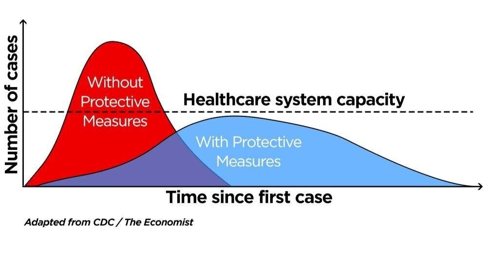

The beauty of the graphic is that it communicates a single message very clearly: limiting social interaction during a pandemic avoids the risk of overburdening the healthcare system and reduces the number of infected people.
The most recent version of the graphic adds another layer of information about the public’s response to the pandemic and the consequences of their choices. In my opinion, it increases the cognitive load for the viewer a bit but it also underscores the point that how we respond to the data makes a big difference in how devastating the pandemic will be.
Critics of the graph argue that it doesn’t represent hard data, but that’s not the point. The point of the graph is to communicate one message clearly, not overwhelm you with data in which the real message can be easily lost. The simplicity of the COVID-19 graphic is its power. Like the simple design and directness of a stop sign. The consequences of ignoring the rules of communicating effectively through good design are chronicled in James Thomas’ riveting article, “Death by PowerPoint: the slide that killed seven people.”
I pray that this pandemic comes to an end soon and that the economic impact is minimal. In the meantime, please share my article with your friends. It’s a good antidote to all of the hysteria out there and short enough to read while you binge Netflix during quarantine.