
The Leadership Alliance
Circle of excellence: Refreshing The Leadership Alliance brand while honoring 30+ years of legacy
Brand Refresh
The Challenge
Established in 1992, The Leadership Alliance is national consortium of higher education institutions and private industry that develops underrepresented students into outstanding leaders and role models in academia, business, and the public sector.
The Alliance’s executive staff requested a refresh for their visual brand — focusing on updating the logo seal and enhancing the existing brand standards. I sat down with the staff in a discovery session and developed a list of weaknesses and strengths of the existing logo.
Weaknesses
Mix of visual styles
Font looks dated
Dislike the “pointy” serifs of the font
Poor readability at small sizes
No symbols representing research, a main focus of their programs
No reference to establishment year
Strengths
Maintain the black and gold colors — they look prestigious
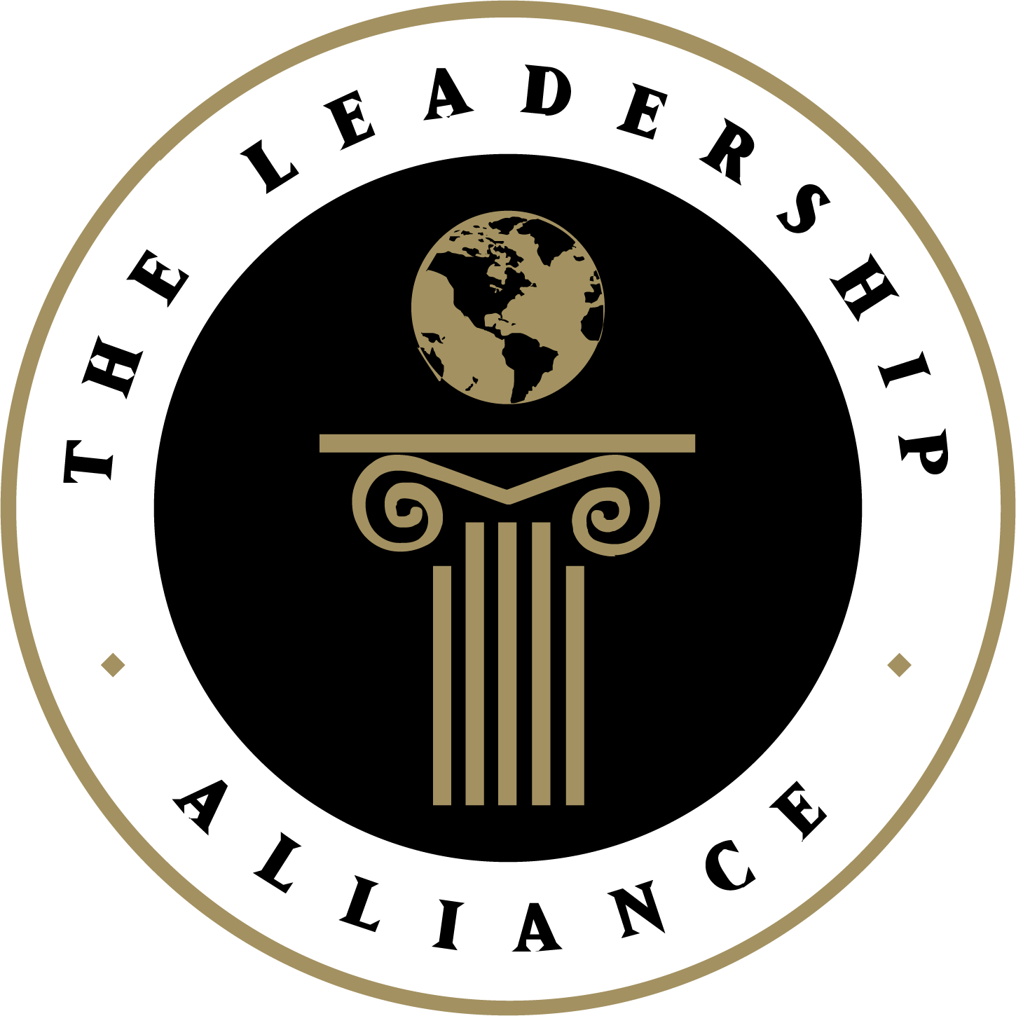
Maintain the overall shape — the circle representing inclusiveness and the concentric circles representing community
Maintain the equity and legacy of the logo seal
The Alliance’s brand guide had issues, too. It contained a color palette of 14 colors, several of which were very similar in hue, and there were no official branded fonts. The thin brand guide contributed to a lot of inconsistency in brand application across all marketing channels.
The Solution
My goal was to incorporate as much as possible of the Alliance’s input to refresh the logo seal and also create a more robust brand guide to provide clear boundaries for consistent application and aid in developing a more dynamic brand.
I started with black and white concepts for the logo seal, testing out different fonts and design elements. One of the concepts that included new symbols to represent a broader representation of the Alliance’s mission was selected to be refined.
There was a lot of discussion about the globe symbol. I had presented some globes that were a simple configuration of ellipses because I knew that they would read very well at small sizes. The client preferred a more literal representation of the globe with continent shapes, closer to the original logo. Eventually we landed on a solution that satisfied both the aesthetic and practical needs for the new logo seal.


Early concepts of the new logo seal (above) and the final logo seal redesign (below) with new symbols.


I reduced the color palette from 14 colors down to just six, making it easier to work with while keeping everything cohesive. The system revolves around Gold and Skylark as the main colors, with tints and tones extending the palette when needed. I replaced the multiple reds and oranges from the original palette with Flame as a single accent color, which packs more punch, and added Plum as the standout new addition that brings some sophisticated depth. This streamlined approach made the design system much more consistent and manageable across all brand materials.


For the brand’s typography I selected two typefaces: Playfair Display for headlines and Noto Sans for sub headlines and body copy.
Playfair Display has the sophistication of a classic typeface, like Bodoni, but is available from Google Fonts which makes it an economical choice for both print and online uses.
Noto Sans (also from Google Fonts) is the workhorse font of the brand, with multiple weights and a low size ratio between uppercase and lowercase letter forms — making it legible at small sizes.

The Outcome
The final result is an identity system (rather than just a single logo), with versions of the logo seal optimized for full-color printing, single-color applications like signage, and versions for special uses like embossed or silkscreened merchandise. The color palette is simple but flexible and the new fonts ensure that The Leadership Alliance brand is represented faithfully across all of their marketing channels.
“Collaborating with Justin has consistently been an outstanding experience. He has a deep understanding of our mission, which enables him to deliver results that often exceed our expectations. When we approached him with our rebranding initiative, he presented a range of innovative and compelling suggestions that truly captured the essence of our brand. We are genuinely excited about the prospect of building a long-lasting and meaningful working relationship with Justin, as his contributions have played a crucial role in our growth and success.”


More Case Studies