
W. Parmentier Photography & Media
Several years ago I developed a brand for my friend and Rhode Island-based commercial photographer, Bill Parmentier. Bill’s start-up specialized in event photography but, in the years since, has grown into a flourishing business that includes multi-media services.
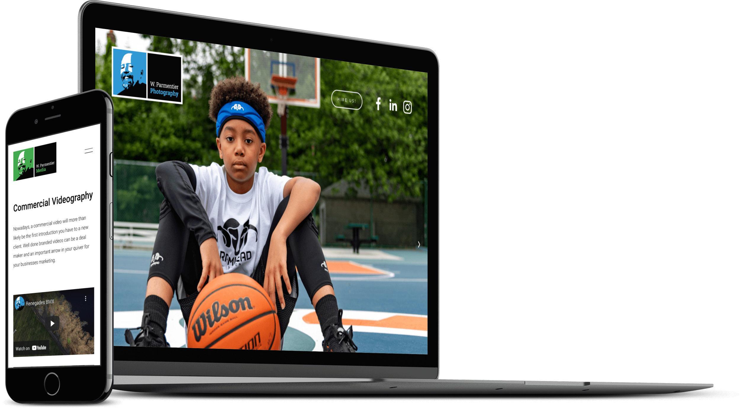
The company was split into two divisions, photography and media, and Bill wanted to expand his brand identity to give each division its own face (so to speak) but still be part of the larger brand. I retained all of the original identity elements, especially the distinctive avatar that had helped W. Parmentier Photography visually stand out from the competition while also reflecting Bill’s friendly and easy-going work style.

I decided a “bento box” system of rectangles would hold the different elements of the logo together and provide a nice container that could be oriented vertically or horizontally, depending on the application needs. A friendly Kelly Green became the media division color; a nice complement to blue of the original logo.
Bill was pleased with the logical evolution of his expanded brand and making the most of his original investment.
“The biggest challenge for me was being open to thinking outside of the box. Justin listened and walked me step by step through the process and gave me a brand that I am proud to show others.”


We used a common back and multiple fronts for Bill’s print pieces to showcase his work and give him the ability to customize his marketing efforts.

