
Broad Arrow Creative
Peter Silvia is a storyteller. I first realized this when we worked together in the late 90’s as a designer and photographer duo traveling up and down the East Coast creating visual narratives for university marketing departments. Peter had a “sixth sense” that allowed him to see a unique photographic story where others just saw clichés.
Fast forward 20 years and Peter and I found ourselves working together again. This time he was starting a new venture called Broad Arrow Creative — a boutique agency that would leverage his visual storytelling skills, his experience as a creative director, and forge partnerships with a select handful of professionals such as writers, designers, and web developers.
“Justin took me on a branding voyage of discovering who I am and what I do. His ability to strategize and navigate was beyond my expectations.”
The brand
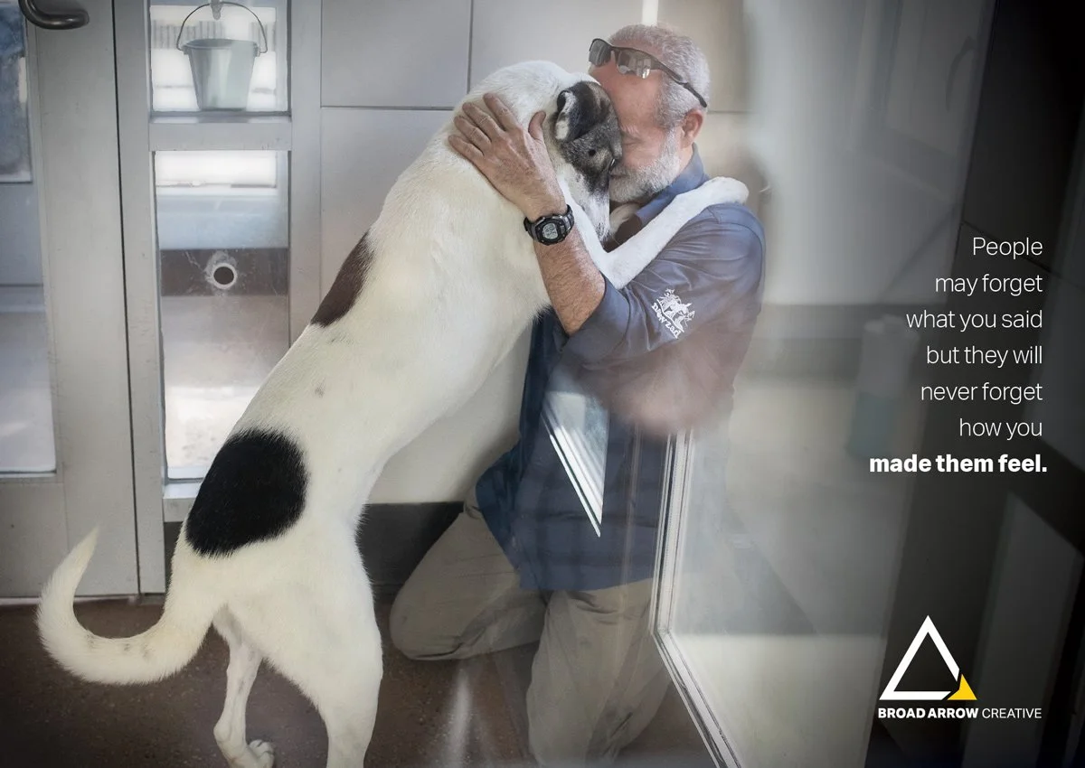
My job was to take Peter’s 35+ years of experience, insight, and talent and develop a brand strategy and identity for Broad Arrow. We focused on how storytelling was the key to making an emotional connection with an audience, and making an emotional connection was key in persuading a prospective client to take action.
The essence of Broad Arrow’s mission is to help humanize a client’s story and evoke emotion in the eyes and minds of their audience with images that will set their brand apart.

The brand identity is simple but dynamic, with a highlight color that Peter refers to as “grease pencil yellow,” a common tool of the trade when photos were still shot on film and contact sheets were the norm for reviewing the stories that film captured.
In addition to a stationery suite and new website, Peter and I designed four direct mail postcards that he could use to put something tactile and compelling in the hands of prospective clients.