

Faith Community Church
From layers of legacy to fresh identity: Rebranding a small urban church
Brand Development
Faith Community Church (FCC) had gone through several identities by the time I was asked to help them rebrand. The small Providence church began life as Faith and Hope Baptist Church in 1984 and then merged with a local church plant, West End Community Church, in 2018. FCC had experienced several changes in leadership since the early 2000’s and the current pastor, Dexley Dorcely, inherited a brand that was a mix of legacy elements from the original church and some newer elements that had resulted from the merger.
Dexley wanted to start fresh and develop a brand that reflected the church’s circumstances as a small, urban faith community with a diverse congregation and their vision to share God’s love with the surrounding neighborhoods.
The church team consisted of Dexley (the senior pastor), Jonathan (an associate pastor), and Sarah (a member of the congregation), which I took through several workshops to develop a new mission, vision, and core values. One of the benefits of working with a small church is the absence of an executive committee or elder board that would typically slow down the process. So the team and I were able to work quickly and codify important decisions during the brand strategy process.
In addition to the more formal and pastoral input from Jonathan and Dexley, Sarah provided a much-needed perspective “from the pews” and contributed some terrific brand gems such as “family of misfits” and being “other-full” which helped ground the new brand and make it more accessible.
Some early sketches and concepts for the new FCC logo. Sketches are a great place to start because they allow you to get rid of all the bad ideas quickly. That “nested” F & C looked really good in my imagination.
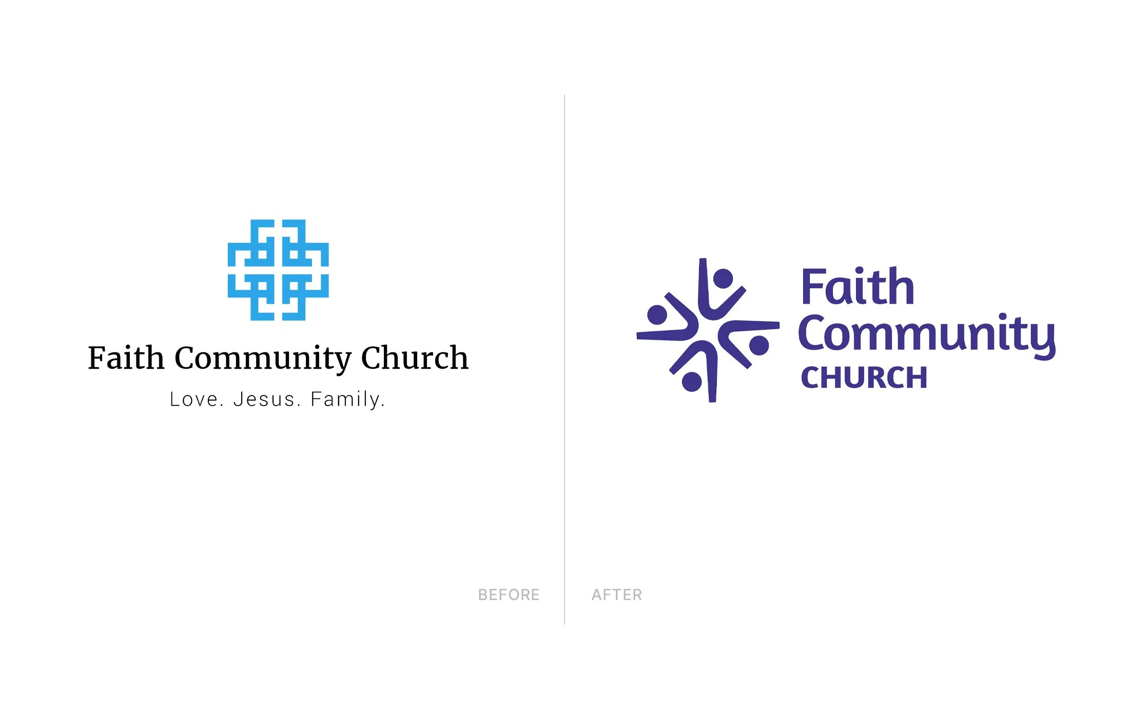
I presented three different concepts to the church team for the visual brand, ranging from familiar to ones that were more contemporary and pushed the limit on what a church logo “should” look like. I intentionally avoided obvious spiritual symbols like crosses, doves, flowing water, or flames.
After reducing the visual brand down to two options, they were put to a secret ballot vote from the congregation and I took the winning concept forward into a complete identity system with multiple versions of the logo, color palette, and recommendations for typography.
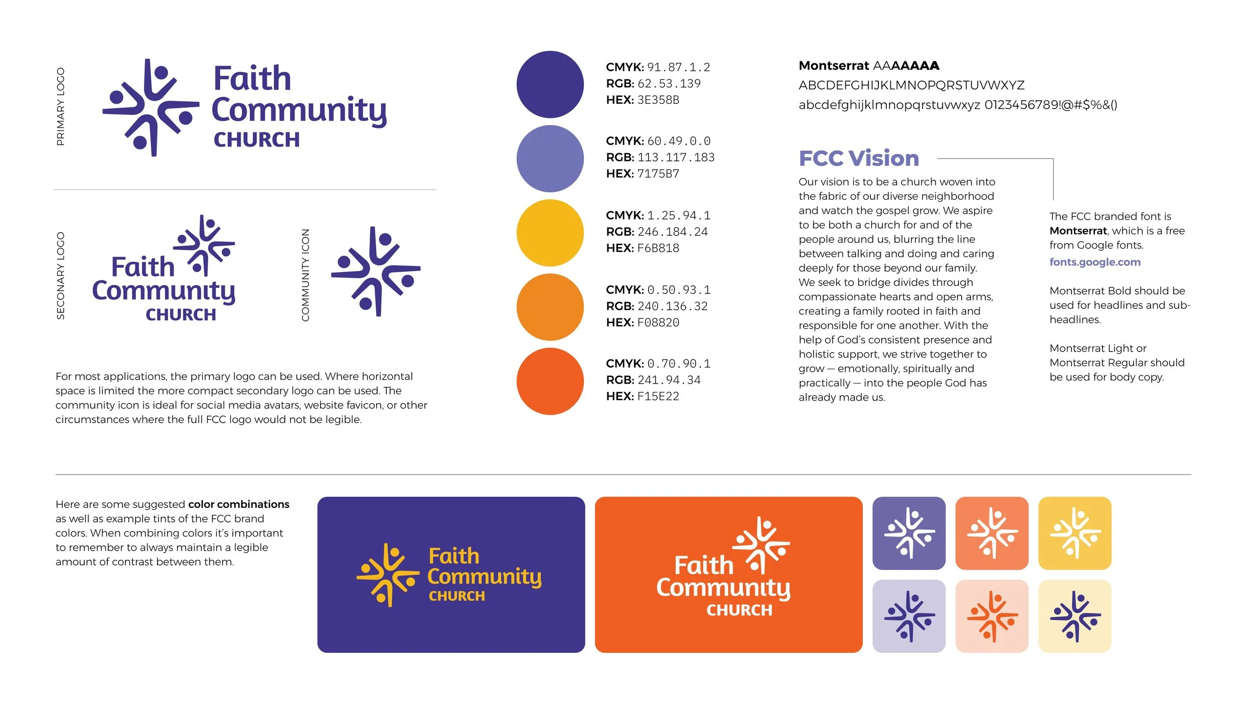
For the logotype, I made “Faith” and “Community” larger to create a visual hierarchy in the name. At one point I tried to convince the team to drop “church” from the new logo altogether, reasoning that the term “Faith Community” could carry all the weight and communicate the concept just as effectively. The team wasn’t willing to go that far and we settled for a smaller font size for “church.”
The new color palette of purples, yellow, and oranges was also a departure from typical church colors. Dexley and the rest of the team wanted something that would provide a visual punch.


“Our church had undergone years of change, and we knew it was time to bring greater clarity to our mission and vision. Justin was the perfect partner to help us do that. He guided us through a thoughtful, collaborative process that resulted in clear and unified language around our purpose, direction, and values—along with a refreshed brand that truly represents who we are.”
More Case Studies


