
Swoosh, there it is.
Your logo is not your brand.
That said, your logo is an important part of your brand. It’s a visual touchpoint — the face that reminds people of their most recent experience with your brand.
Imagine you meet up with a friend for coffee and you notice something stuck to their face or in their teeth. As a friend, you’d point it out because you know it’s not supposed to be there, right? Of course you would.
So what’s with the swoosh stuck on your logo?
You’ve seen them everywhere. Random swooshes inserted above, below, or encircling the name of a company.

Hmm… it needs a random design element to make it “pop.” Fixed it!
“Swooshing” is probably one of the laziest methods for designing a logo:
Step 1: Type your company name in the first font that shows up in the font menu (probably Arial).
Step 2: “Italicize” the text so it slants to the right.
Step 3: Add a swoosh.
Done!
What’s wrong with the Swoosh?
There’s nothing inherently wrong with the swoosh as a design element but if it’s part of your logo it should be integrated with the other design elements and add meaning to the whole. When you randomly add a design element to a logo, at best it’s neutral and, at worst, it’s distracting and muddles the message.
Unfortunately, the swoosh has become the most common species of logo design. I had a client literally tell me, “Add a swoosh to the name because then it’ll be a logo.” If you could see my face right now, my RBF is turned up to 11.
I’m not sure who’s to blame for this cheap and easy solution to logo design, but I’d like to tattoo a swoosh on their forehead and say, “Look! Now you’re a logo!”
Guidelines for good logo design
Form follows function: If you want to use a swoosh in your logo design make sure it represents something (motion, connection, power) that’s connected to your brand message. Not sure what your brand message is? Then you should define one before designing a logo.
Parts of a whole: Every element in your logo (shapes, typography, color, composition, visual tension) should contribute to your brand message and not simply add noise. Think of the logo elements as an orchestra with each instrument making a unique contribution to the entire musical arrangement (Hey! Who let the bagpiper in?).
Don’t be a cheapskate: Hire a professional to design your logo. How do you know if you’ve hired a professional? One clue will be that you’re investing more than the cost of a mocha latte but, more importantly, you’ll be taken through a process to determine the meaning behind all the elements of your logo, especially that swoosh.
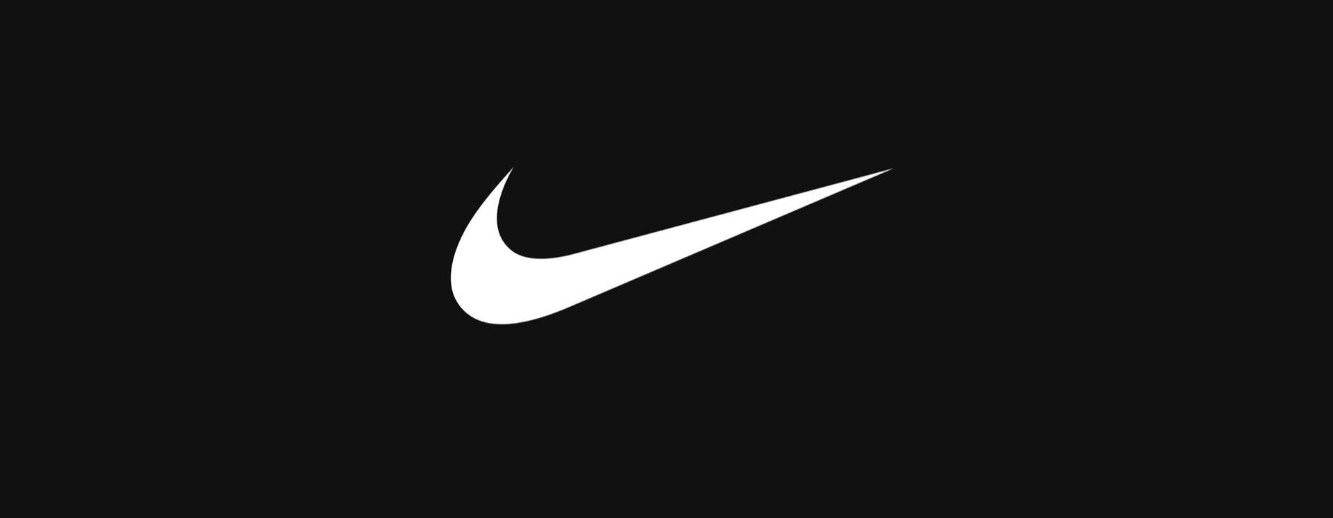
Good swooshes:
The winged Greek goddess of victory, Nike.

The smile you have on when your package arrives.

Flight and orbit. Necessary for exploring space.
Bad swooshes:

That swoosh means business, dammit!

Fish hook? Amish beard? You decide.

You can be unique, just like everyone else.
If you’ve made it this far…
Thanks for taking a moment out of your busy day to read my rant about bad logo design. I’m passionate about good design and its role in brand development. I’m also passionate about helping start-ups, entrepreneurs, and small businesses discover their true brand. If you’re ready to start that journey, I’d love to be your guide. Let’s talk.