A Refreshed Brand for Bug Light Bookkeeping
Cathy Costello is a 25-year veteran bookkeeper, business advisor, and micro-business entrepreneur. Her company, Bug Light Bookkeeping, provides customized bookkeeping, financial analysis, and financial consulting services with a focus on organization and attention to detail. Much of Cathy’s expertise is captured in her tag line, “We bring your business to light.”
Cathy and I are members of a local business referral network and she had heard many of my weekly “commercials” about branding and developing distinctive visual identities for entrepreneurs. We had also spent time getting to know each other so Cathy didn’t feel like she was approaching a stranger when she asked me to help refresh her visual brand.
honor the past, prepare for the future
The previous Bug Light logo was drawn by Cathy’s daughter. Although it was a faithful reproduction of the Duxbury Pier Light (known to locals as “Bug Light” because of its small size), the illustration’s delicate line work and color application didn’t truly reflect Cathy’s personality. Also, some of the finer details of the drawing were getting lost when the logo was reproduced at small sizes.

The original Bug Light Bookkeeping logo

The “Bug Light” (Duxbury Pier Light in Plymouth
For some businesses owners their logo has deep personal meaning and this was the case with Cathy and the Bug Light logo. Plymouth harbor, where the lighthouse sits, was a summer hangout for Cathy when she was a young girl. The diminutive but sturdy lighthouse (it’s survived 30-foot hurricane swells) represents Cathy’s determination and resilience. Her mother was the primary inspiration for Cathy starting her own business and the logo is a tribute to her, as well.
So when Cathy asked me to redesign her logo, I wanted to make sure I honored its legacy while also giving her an updated visual identity that could scale with her business into the future.
Finding Cathy’s why
We began with face-to-face discussions about her business, its history, and Cathy’s family. I wanted to discover Cathy’s “why,” her purpose, the reason she jumps out of bed every morning with enthusiasm and passion. As she talked more about her family I realized her mother and daughter played key roles in her purpose.
Based on our interviews and a branding worksheet I had provided, Cathy and I developed four themes around which I would redesign the Bug Light logo: grace under pressure, adaptability and growth, relieving stress / shining a light, and the legacy of Cathy’s personal story.

There was no question the lighthouse would be at the center of the new logo as it encompassed many aspects of the four themes. Lighthouses guide ships safely around dangers that lurk just below the surface of the water and provide clarity with a bright light that pierces fog and darkness. Lighthouses are also part of a network, working in collaboration to bring ships safely up the coastline and through channels.
Visual Design
One of the challenges was creating a visual representation of the Bug Light that landed somewhere between a detailed illustration and a graphic symbol. In simplifying the illustration, which details could I remove and still maintain the distinctiveness of this particular lighthouse?

Some iterations of the light house graphic.
The previous logo had a splash of red in the name but it was absent in the illustration of the lighthouse (it’s like painting the Mona Lisa without her smile). I wanted to make sure lighthouse’s signature red would take center stage in the new logo. Not only would it help identify the lighthouse but red would help Cathy’s brand stand out in the business services sector, already awash in blues, greens, and grays.
The original typeface I had selected was a bit too masculine for Cathy’s taste. Not that she wanted a delicate typeface, but something closer to the center of the masculine/feminine scale. Plus, when Cathy pointed out it reminded her of the Budweiser logo that pretty much drove a stake through the heart of that typeface and reminded me how important client feedback is to the process. I came up with an alternative typeface that was lighter in weight and still had a traditional New England look and feel.

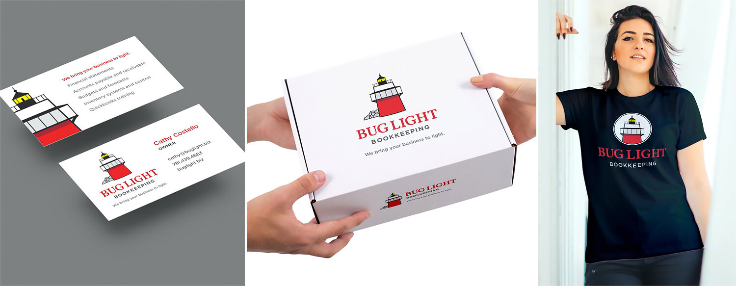
Logos should not be developed in a vacuum so I showed Cathy how her new logo would look in the context of her marketing. When she saw the multi-purpose client onboarding and receipt box I proposed, she was sold immediately. The final box had a large logo on the top of the lid and a smaller one on the front so that, even if the client put the box on a shelf, Cathy’s brand would still be visible. I also designed a business card and make recommendations for branded merchandise (where’s my t-shirt, Cathy?).
Final Thoughts
Cathy was ultimately very pleased with the refreshed logo and the flexible identity system that will scale as her business scales. I’m pleased to be able to maintain the heart of Cathy’s brand and strengthen the message of her mission to shine a light and guide small businesses through murky waters and safely into the harbor of financial clarity and growth.
If your brand is overdue for a refresh or you’re on the cusp of starting a business, let’s talk. You can book a discovery call with me by using the link below.