Metropolitan Salon
When Holly Yarush became the new owner of Metropolitan Salon in Barrington, RI she wanted to rebrand the upscale boutique with her own aesthetic while preserving some of the legacy that the founder, Judith, had spent years establishing.
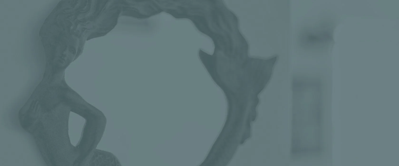
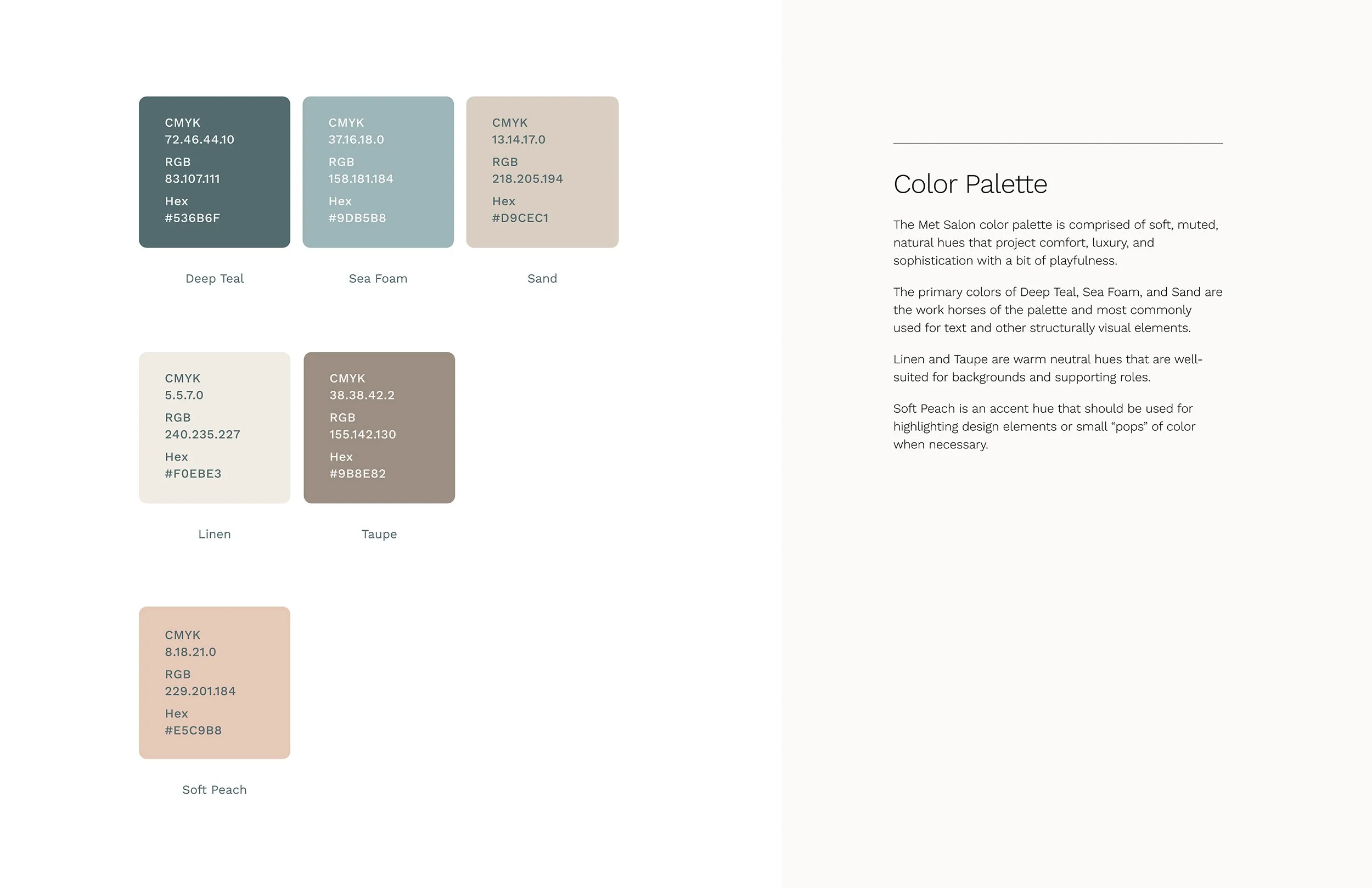
Holly wanted her new brand to reflect the salon’s seaside location and promote an atmosphere of comfort, relaxation, and fun for the clientele. She sent me a Pinterest board with sophisticated typography, beach textures, and a coastal color palette of muted blues and greens, light browns and off-whites. The direction was clear and it streamlined the visual brand process. Sometimes it’s more productive working within a narrow channel rather than with unlimited options.
I presented three concepts for Holly to consider — two of them centered around an “M” monogram and a third concept that combined a scallop shell illustration with an Art Deco-inspired logotype. One of the monograms merged a classical typeface with the playful flourish of flowing script. The other monogram incorporated soft, organic waveforms that resemble flowing water or cascading hair. I kept the color palettes confined to the coastal inspired hues of muted blues and soft earth tones.
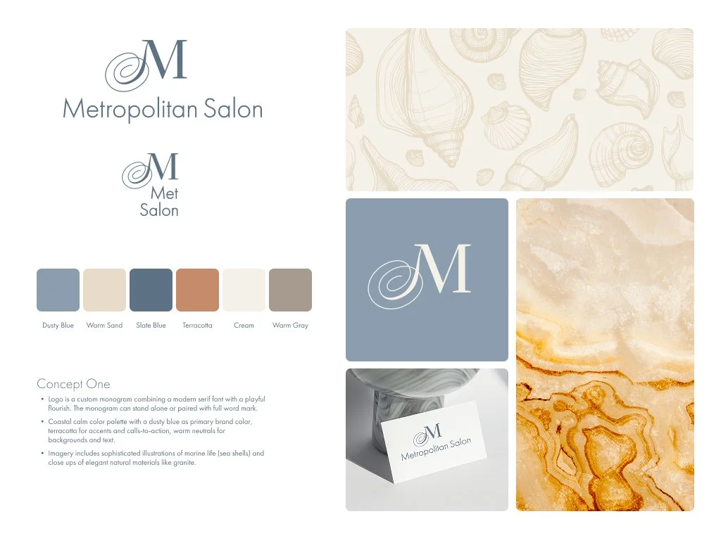
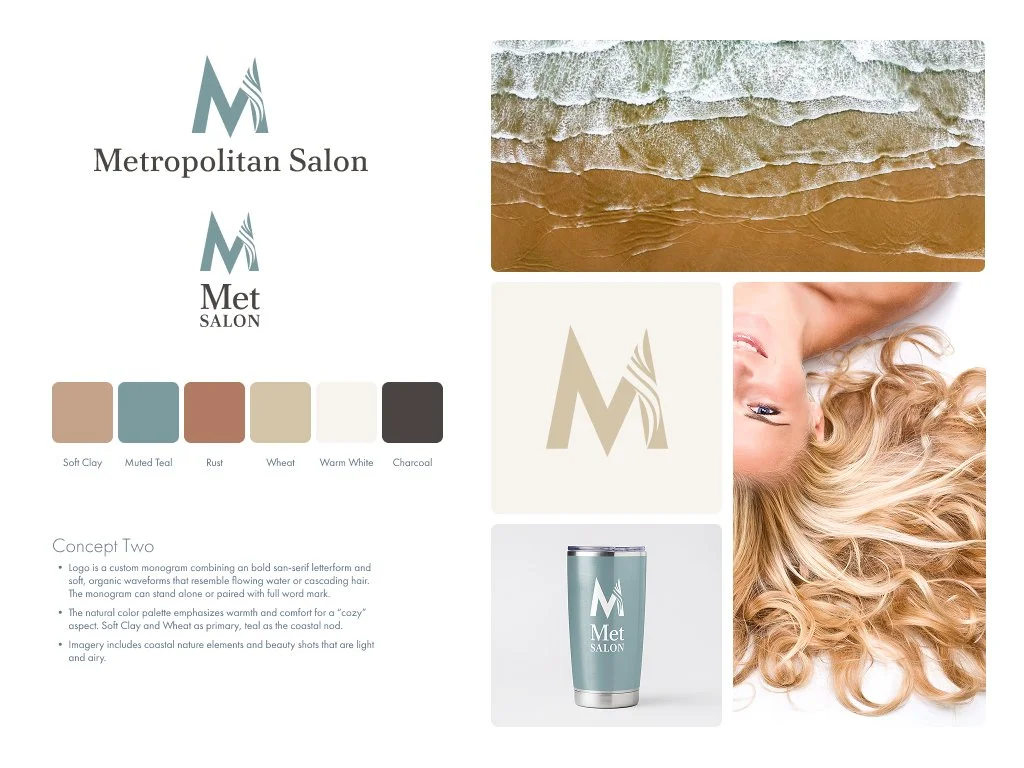
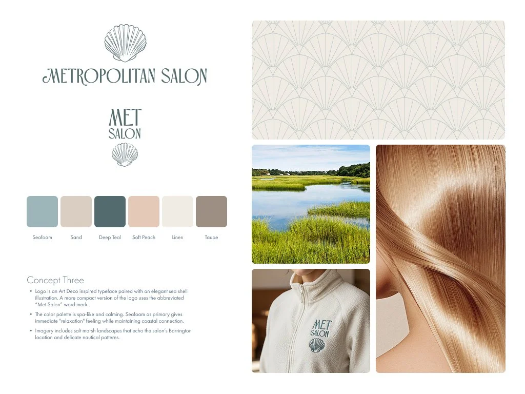
The three visual brand concepts presented to the client
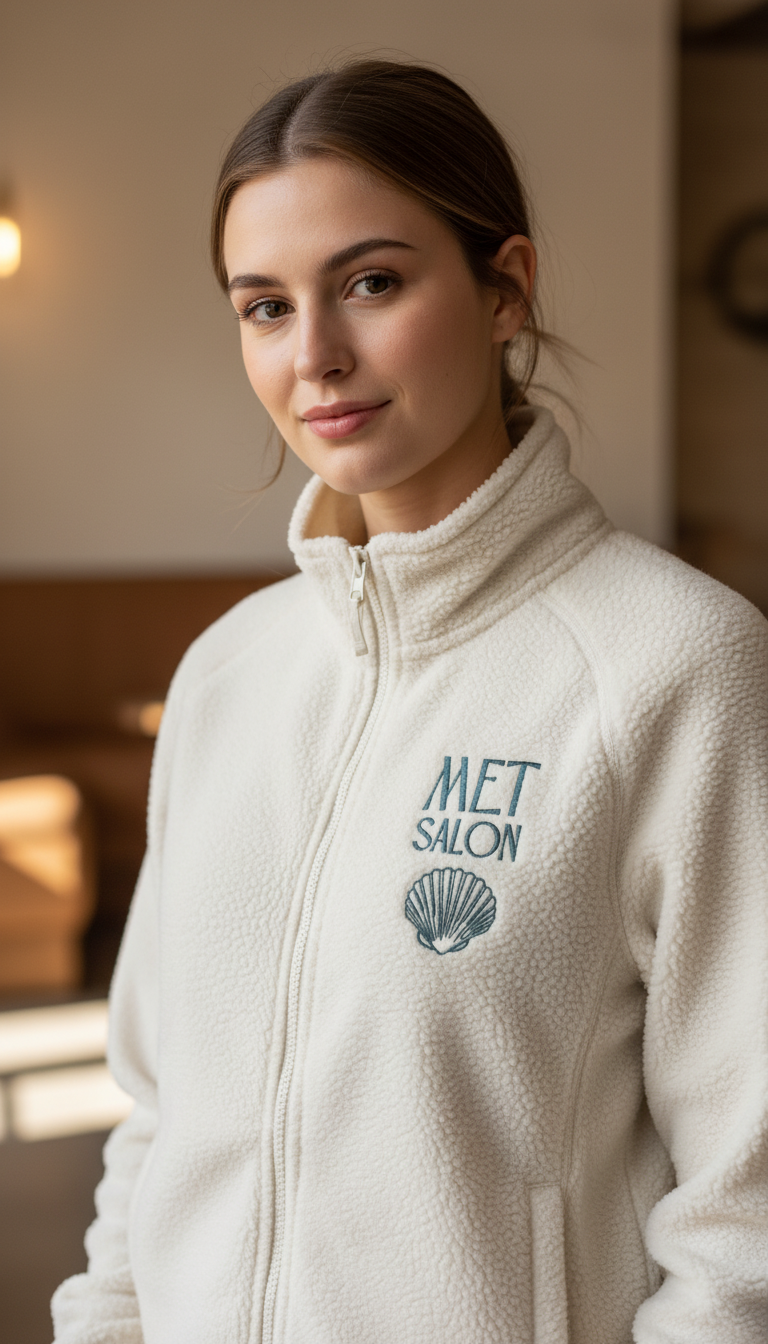
Even though the legal name of the business is Metropolitan Salon, clients often refer to it as Met Salon so I included this as part of the brand presentation. When Federal Express rebranded in 1994, the name was shortened to FedEx — one reason was because that’s the shorthand their customers had been using to refer to the company as well as the service. Your brand isn’t necessarily how you perceive it but how your clients perceive you.
I always recommend to my clients that they “live” with their brand concepts for a few days or even a week and pin them up on a wall so they can see them multiple times a day. I’ve discovered that, while first impressions are important, the concept that clients ultimately choose is the one that grows on them over time. I also provide mockups so they can see each concept “in the wild” because, seriously, the only time you’ll see your brand isolated on a white background is on a presentation board.
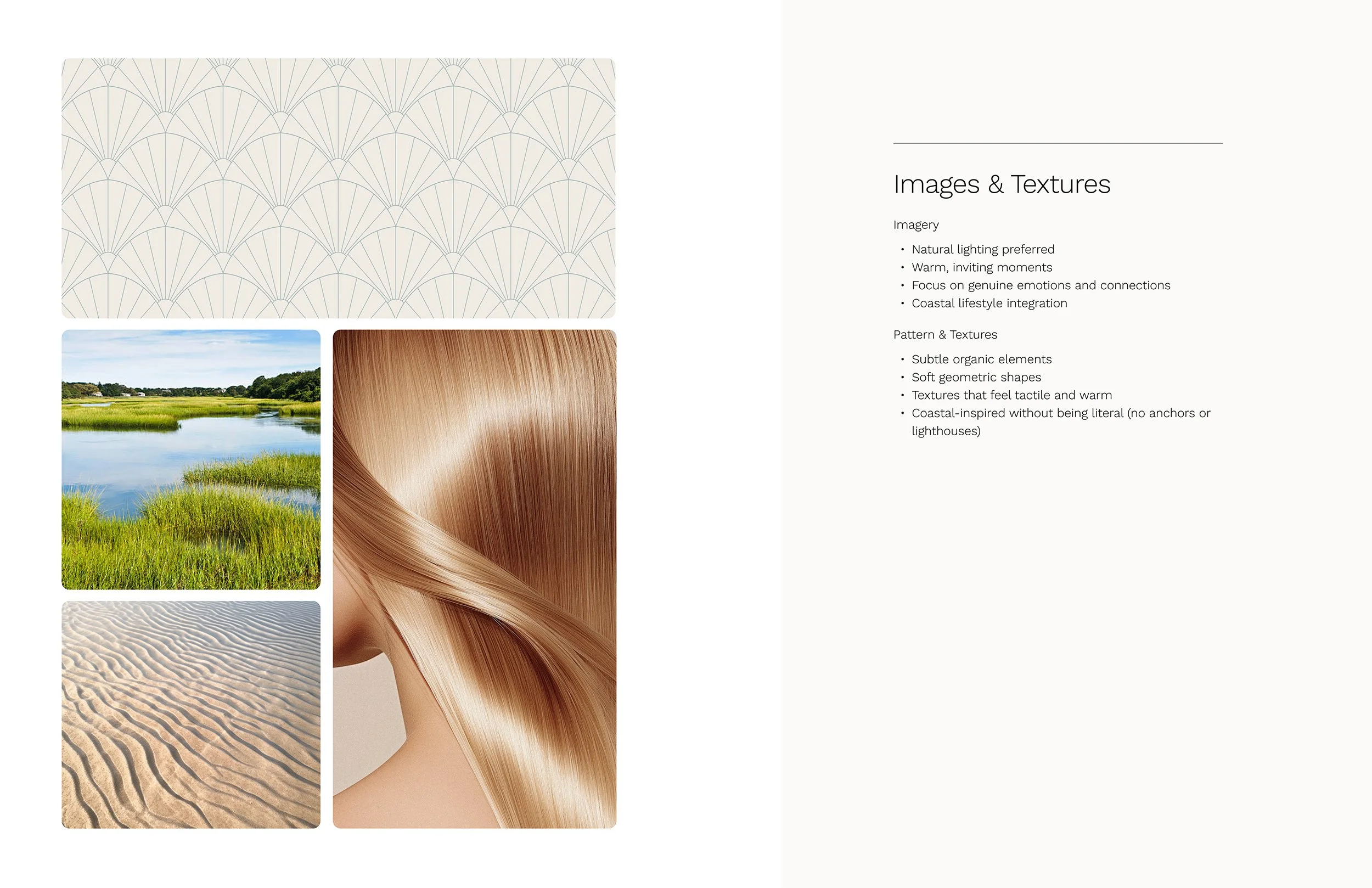
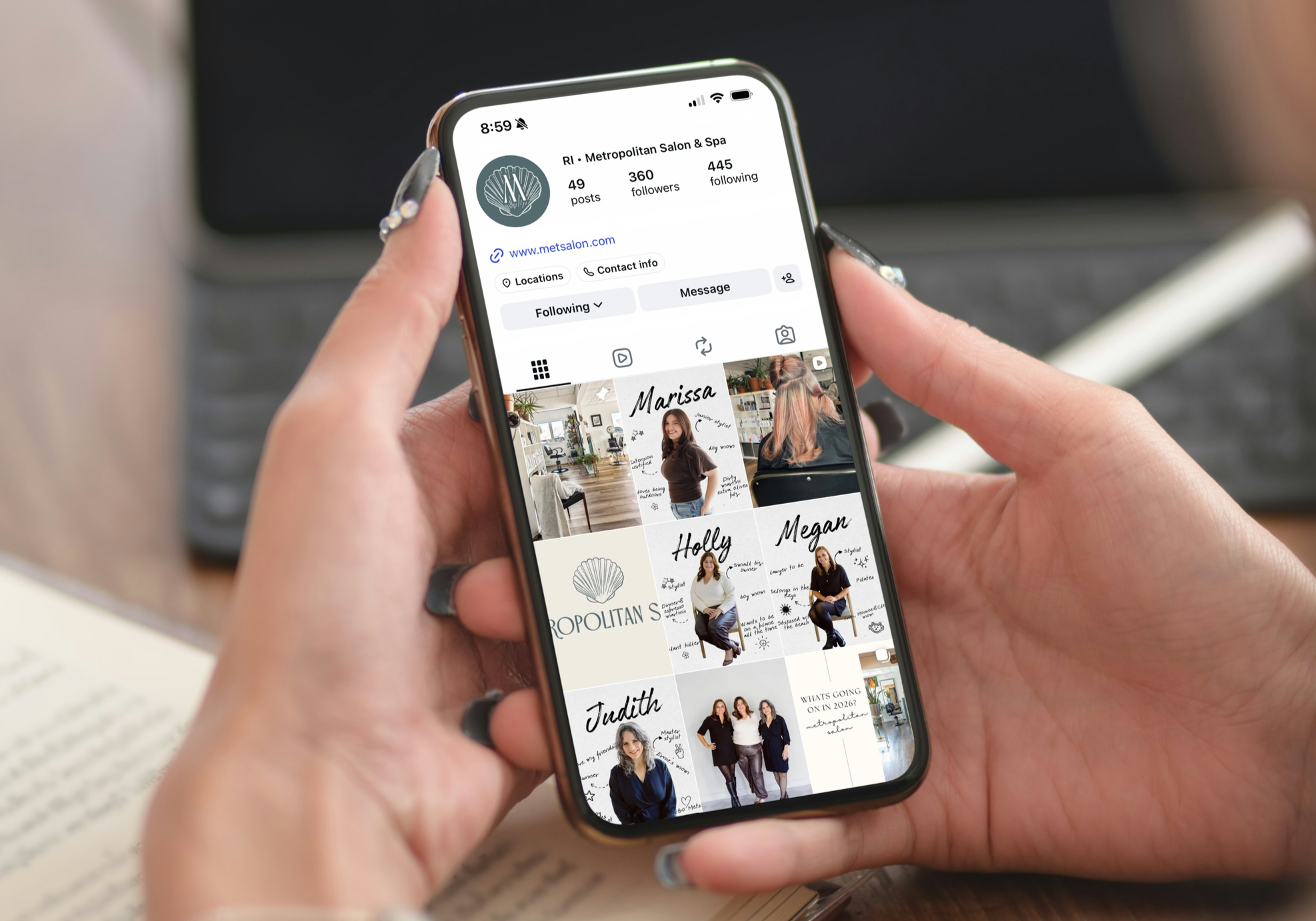
Holly chose to move forward with the sea shell concept and confessed to me afterwards that it was her first pick from the minute she saw it. So first impressions prevailed this time. I expanded the winning concept into a full identity system with multiple versions of the logo, color formulas, and recommendations for textures and imagery.

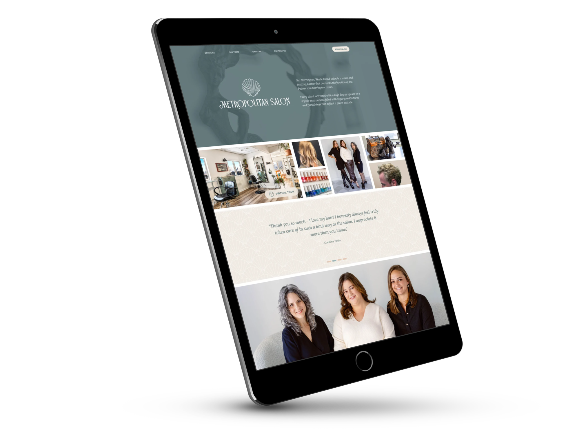
Next, we moved forward to apply the new brand to a redesigned Met Salon website. Although the new website is modest in size (just five pages) I partnered with Atom Web Design to develop it on the Wordpress platform so it could easily be scaled in the future. I provided full-page designs, Atom provided the development expertise, and together we gave Holly and Met Salon a new look and a refreshed marketing presence.
“Justin made the process so easy and stress free. I came to him with a ton of ideas going in all different directions and somehow he took all my ideas and formed the most beautiful brand. Everything looks beautiful and I am so happy with everything he did.”