UTAK Custom QC Brochures
UTAK is an elite manufacturer of stock and custom controls for use in forensic testing labs — and their sales reps needed a set of brochures to encompass their vast catalog of controls. Their previous brochures had been designed by a variety of vendors over the years, which produced an inconsistent and muddled brand look.
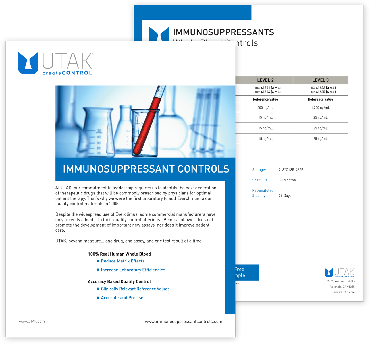
The previous UTAK brochures were a mishmash of styles and formats.
The Challenge
Provide a fresh look & feel for the brochures and incorporate the new UTAK logo.
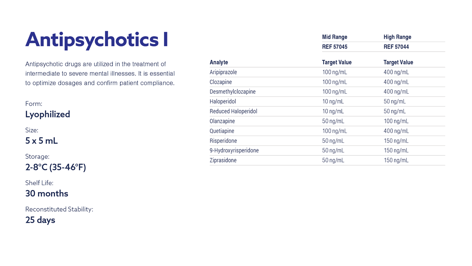
Condense the high volume of data contained within each control brochure into a manageable format that is easy to scan and easy to read.
Create a family of brochures that UTAK’s sales representatives and their lab clients can quickly distinguish from each other, while maintaining a cohesive branded look.
The Solution
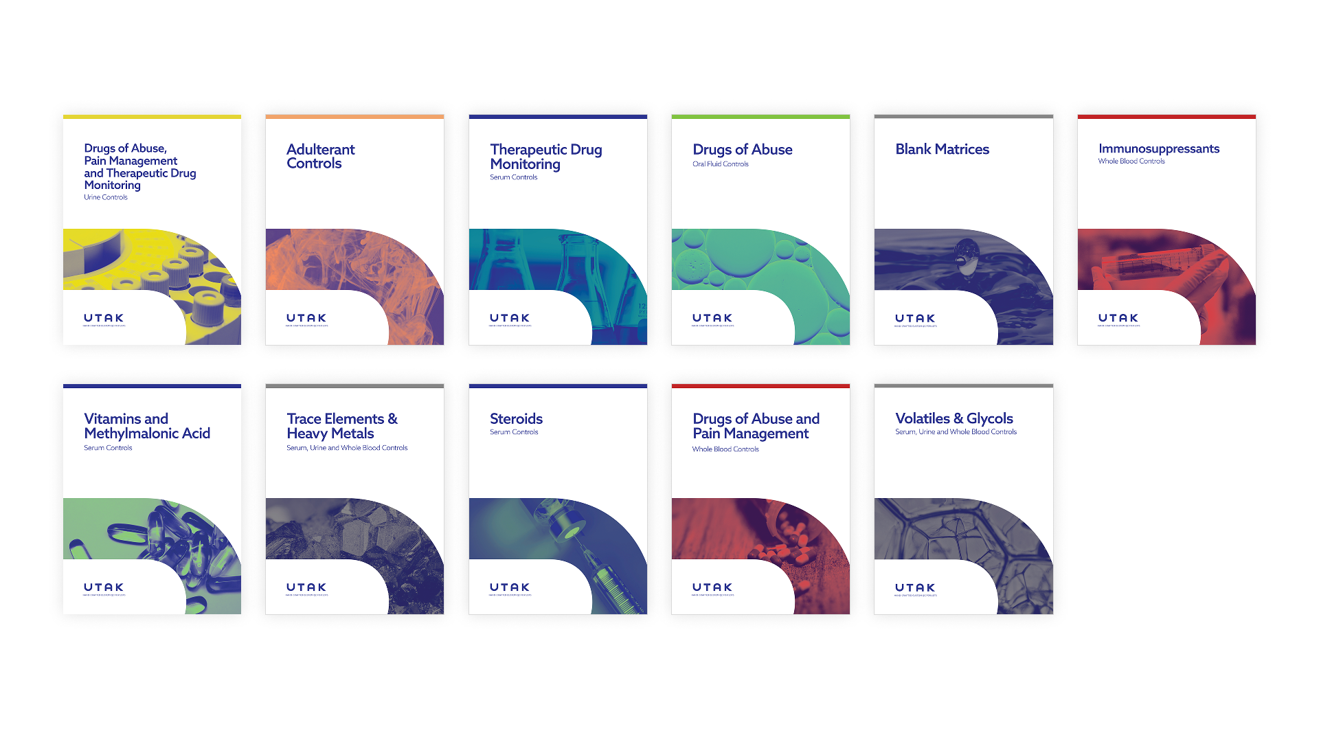
Rather than one massive alphabetized brochure I designed multiple brochures, grouped by common usage to better target specific labs.
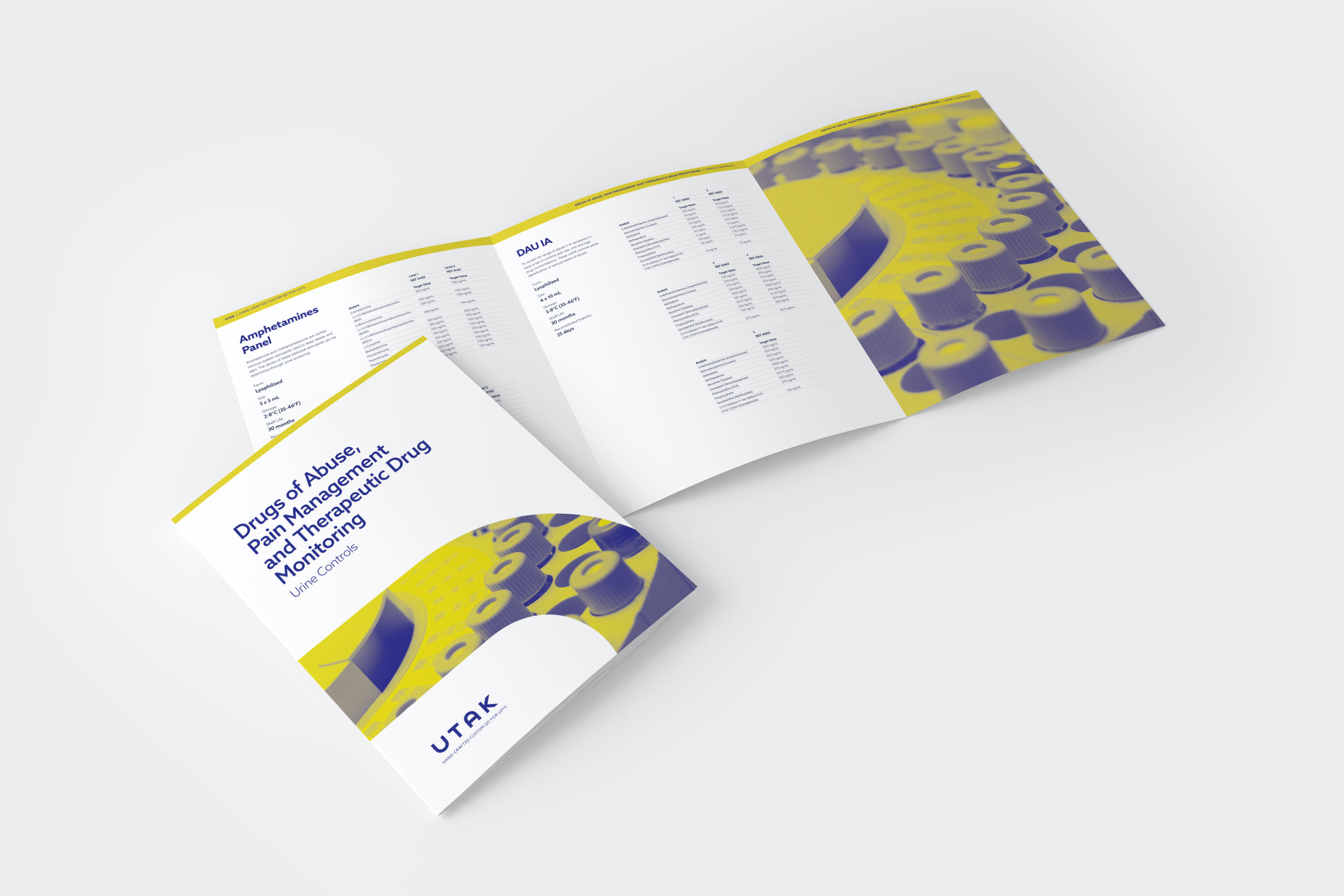
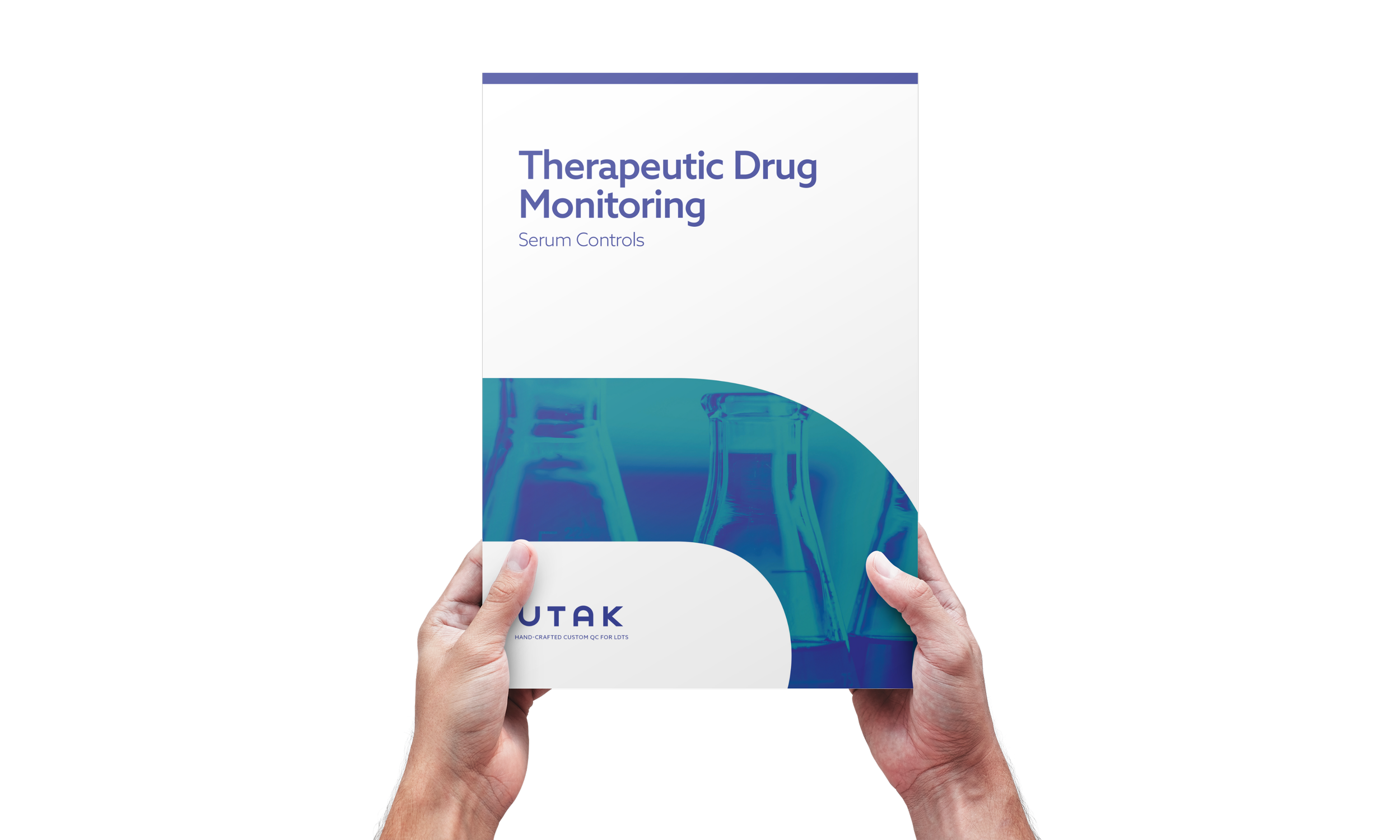
A standard letter-size format would make the brochures easy to mail and place into binders or folders. A mid-weight cover stock would help the smaller 1-sheet brochures feel substantial in someone’s hand and still accommodate the larger multi-page brochures without making them too bulky. I designed a 16-column layout that would provide plenty of flexibility for both the marketing copy and the multiple columns of control data.
I assigned key colors for each control type: yellow for urine, red for blood, blue for serum, etc. so sales reps could easily identify them. Brochures that contained multiple controls would be color-coded gray and a color bar across the top of each cover would help distinguish the brochures when they were nested in trade show display racks.
I kept the visual design simple to enhance the readability of the data instead of obscuring it with unnecessary decoration. A large curve — inspired by the rounded letterforms in the UTAK logo — served as a unique visual element and a frame for the distinctive duotone cover images, hinting at the control group’s purpose.
For the body copy, I chose Nimbus Sans typeface for its wide range of weights (including a condensed) and legibility at small sizes — perfect for the control data. I paired this with the distinctive Azo Sans typeface for headlines.
Once I established my design system of page layout, fonts, colors and imagery the brochures were fairly straight forward and easy to produce, with only a couple of outliers that required additional design consideration.
While making the brochures aesthetically pleasing was important, a design system was the primary focus in redesigning the UTAK brochures — one that could easily be reproduced and applied to sell sheets, presentation decks and web pages — ensuring brand consistency across multiple marketing channels.
“Justin is an incredibly talented designer, and we are a better company for his involvement. He provided recommendations for best practices and that expert opinion helped guide us.”